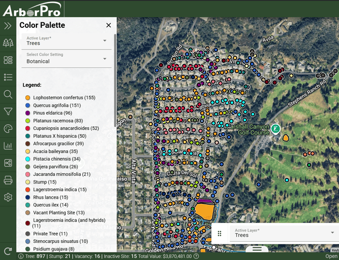
The Color Palette Pane is a valuable visual tool that helps you quickly interpret data from your Map View. From here, you can assign colors to a layer’s field information, allowing the data to be visually represented in your Map View.
Use this tool to organize points by color and quickly select groups of points based on their assigned colors.
How to Use the Color Palette Pane:
Step 1.) Access the Color Palette
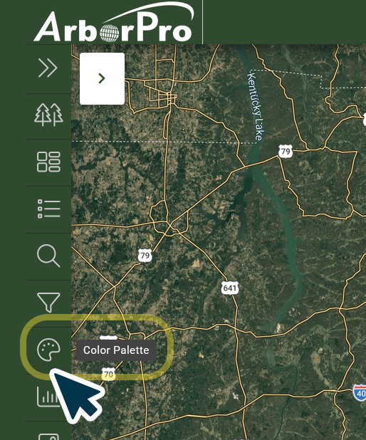
Click on the Color Palette Button within your Data Analysis Toolbar.
Step 2.) Select Your Layer
Select an Active Layer, then use the color setting dropdown menu to update the Map View.
.png?width=670&height=490&name=image(24).png)
Step 3.) Create a Selection
Click a color setting from the Legend results to select and highlight it on your Map.
ArborPro Tip: Data setting options will show the number of data points they contain next to their name.
ArborPro Tip: There are a limited number of colors available within your color settings. Colors are automatically assigned according to numerical values and will appear in descending order, with the most populated categories displayed first.
Legend categories beyond the first 49 are automatically grouped into an "Other" category.
.png?width=670&height=490&name=image(25).png)